Introduction
Reading the title of this article, the first thing that will come to mind for some is the funny expression of Buzz Lightyear – the Disney character – when he stretches his arms outwards and utters the famous phrase “To infinity and beyond!” before jumping into the void. If we were to make an analogy between the production of Toy Story and the Apollo 11 mission, we would discover two exciting things. The first is that the protagonist previously mentioned takes his name from the second astronaut who trampled the lunar soil after Neil Armstrong – for the record, Buzz Aldrin.The second concerns the techniques with which Toy Story was made, completely and radically revolutionizing the animation film production industry. Even the Apollo 11 mission – in a much more exponential and irrepressible way – has led to a profound change in our humanity. It has opened up a new era in science and technology and had touched and influenced many economic sectors, not just those relating to cinema.
In addition to touching and revolutionizing many economic sectors of the time, including the film industry, the Moon mission opened up new paths in the field of graphic design due to the plaque anchored to the LEM leg, which reported the following words:
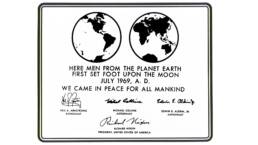
Here Men from the planet Earth first set foot upon the Moon July 1969, A.D. We came in peace for all mankind.
The typeface chosen for the engraving was Futura, which soon became one of the most famous and commonly-used fonts in the design field.
“Futura, I am your father”
The evolution of the Futura font is full of unique events and anecdotes.
One of the most fascinating aspects lies with its creator or, as some claim, creators. In fact, graphic historians attribute the paternity of Futura to the German designer Paul Renner. Renner began designing the characters in 1924 and published the font in 1927 as a contribution, commissioned by the Bauer Type Foundry, for the New Frankfurt. This was a magazine in circulation from 1926 to 1931 and was dedicated to international trends in architecture, art, housing, and education. However, some studies attribute the ideation of the character to Ferdinand Kramer, a German architect and functionalist designer.
The doubt about the paternity of the character is due to an archive finding discovered in Kramer’s study: a sketch entitled “Kramer Grotesk” which still raises questions, mostly speculative, about the origin of the Futura (Pohlen 2017).
The Importance of Being Future
Leaving Renner the merit of designing the Futura, it is good to dwell on the characteristics that have distinguished this typeface from its contemporaries. While presenting some similarities with characters previously known to the public, such as Akzidenz Grotesk developed by the German foundry H. Berthold AG in 1896, Futura was much more successful for two reasons in particular: its name and its geometry.
Many designers of the time designed characters to celebrate the new industrial era: they wanted to create something unique for a new world. We have had other examples from German printers, some of which are very similar to Futura.
What you immediately notice is the difficulty in pronouncing or remembering names. Something different happens concerning Futura: it is a simple name and has the extraordinary ability to evoke and convey the idea of how the future and modern era awaiting humanity would look. A German name was not chosen precisely because the goal was to address a vast and universal public.
Anatomy of a Font
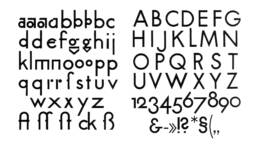
The influence of the Staatliches Bauhaus, the German art school, in the realization of Futura is very much evident. Although Renner was not an active member of the school, he shared its ideas. For example, he was convinced that it was necessary to create something new; to design new typographic models without replicating previous designs. The decision to produce a font that reflects the idea of functionalism and essentiality by depriving the useless character of decorations and graces was a typical element of the modernist current. Quoting Mies van der Rohe, it can be said that Renner operated typically of the Less is more philosophy. The character design, with simple and rigorous lines, incorporates the following geometries: square, circle, triangle. These features can be found by looking at the images below: you can see that the have been derived from the isosceles triangle.
The Other Reich Font
The path that led Futura to be adopted as one of the official Reich fonts is full of twists and curiosities.
First, the use of the Gothic style was predominant in Nazi propaganda – and this clashed very much with the rigor of Futura. At that time, Fraktur was used: a typeface born around sixteeth century from the Bohemian chancellery of Maximilian I of Habsburg as a form of elegant court writing. The Reich adopted Fraktur around 1930 and used it for several years in various media dedicated to the spread of Hitler’s National Socialist policy.
Another important event that delayed the use of Futura was the arrest and exile of Paul Renner himself, who, in 1932, published an anti-Nazi essay entitled “Kultur-bolschewismus.” It was around 1936 that things began to change and Futura began to appear on the pages of one of the most famous manuals known to the Nazi regime: the Organisationsbuch der NSDAP. Shortly after that, the use of Fraktur began to diminish to give voice to a more modern and contemporary and more readable style.
But it was not simply the desire for modernization that led the Nazis to change fonts. The transition to Futura was also imposed by the fact that the previous character presented, according to the opinion of the time, graces too similar to Hebrew writing, making Fraktur an impure character and not suitable for representing Nazi ideology.
An American Tail
A typeface similar to Futura first appeared in 1929 in the pages of a magazine, Vanity Fair. Unable to use Renner’s font, Mehemed Fehmy Agha – art director of the magazine – decided to entrust the redesign of a similar typeface to the Baltimore Type Foundry. In honor of the publishing house, it was renamed Vogue.
The reason lies in a well-known historical event: the collapse of the 1929 stock exchange led to the imposition of a tax on typographical characters from Germany. This therefore led to the economic collapse of many European foundries which settled in the United States after World War I, including the Bauer Type Foundry, that at the time marketed Futura in the United States.
But why switch from a graced font to a stick? The idea was to eliminate the emphasis on capitalized letters in favour of a more modern and egalitarian style, while maintaining an authoritarian and essential tone. However, the interest in Futura went beyond the walls of the publishing house, coming to knock on the doors of one of the most important government agencies on the planet: NASA.
The First
Futura, along with its clones, soon became a mainstream font in the United States. At the end of the World War II, it was used in encyclopaedias, in tables, in graphics, in maps, and even in propagandistic elements of American politics. When the American government decided to adopt a new typeface, the choice of Futura was not surprising but it was not chosen as an aesthetic declaration of modernism. Instead, it was because of its ability to transmit authority.
It is no coincidence that NASA used the font for its entire communication system: from food ration labels to indications on the Saturn V control panel.
It was even used for the writing on the famous plaque, which reads as follows:
This plaque, however, does not only symbolize the passage of man to another celestial body, but also represents a deep history. The story of Futura is very intense, following the evolution of man from World War I to the discovery of the Moon. Although these past events are still very much alive in our collective memory, the font is still with us and currently used. Futura not only went to the Moon, but far beyond, becoming part of our human and cultural heritage.
Reference List
- Eisele, Petra, et al. 2017. Futura: The Typeface. London: Laurence King Publishing Ltd.
- Burke, Christopher. 1999. Paul Renner: the art of typography. New York: Princeton Architectural Press.
- Edwards, Phil. “Futura: the font that escaped the Nazis and landed on the Moon,” Vox (24 Febraury 2017). https://www.vox.com/videos/2017/2/24/14702206/futura-font-paul-renner-history
- Heller, Steven. 2011. Iron fists: branding the 20th century totalitarian state. London: Phaidon.
- Pohlen, Joep. “The Myth of Kramer-Grotesk,” Typography.Guru (31 May 2017). https://typography.guru/journal/the-myth-of-kramer-grotesk-r51/
- Thomas, Douglas, and Ellen Lupton. 2017. Never Use Futura. New York: Princeton Architectural Press.
Photo credits
- Cover image © Martina Cavalieri
- Photo: Futura original drawings. Paul Renner’s first design for Futura.
Source: https://designkultur.wordpress.com/2011/02/04/corporate-identity-designkultur-new-wordmark-logo-introducing-v-2-0-a-corporate-id-rethink/paul-renners-first-drawings-for-futura/
Year: 2011 - Photo: Some German fonts similar to Futura.
Author: Douglas Thomas
Source: https://www.youtube.com/watch?v=PUW89NpDYJw
Year: 2019 - Photo: Futura Geometry. Futura it is based on geometric shapes, similar in spirit to the Bauhaus design style of the period.
Author: Martina Cavalieri
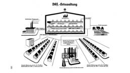
Year: 2019 - Photo: Organisationsbuch der NSDAP. A detail of the manual, the descriptions are written in Futura font.
Source: https://archive.org/details/Ley-Robert-Organisationsbuch-der-NSDAP
Year: 1937
Martina Cavalieri
Design Ph.D. student at UniGe and graphic designer focused on logotypes and web interfaces. My research revolves mostly around the areas of inclusive design and digital accessibility.
On Instagram: @martinacavalieri_