We could say it all started on the 4th October 1957, when the Soviet Union launched the first artificial satellite, Sputnik 1. After that event, on the 31st of January of 1958, the United States’ satellite Explorer 1 was launched and few month later, on the day of my birthday, the NASA was created. That year set the dawn of the space age. While, until 1990, the United States and the Soviet Union together accounted for a combined 93 percent of satellites launched – most of which military, today private companies, non-profit organizations, and other public entities are rapidly developing and launching imagery satellites (Kim, 2019).From the early 2000s, free satellite images and maps were available online. Keyhole was bought by Google and diffused as Google Earth in 2004. In 2005 on Google Blog a new map service was announced and in July of the same year Google Maps published the hybrid version map, that mixed satellite view and road maps. On July 2016, Google uploaded 700 trillion of pixels of new data, with satellite images from all the world (Meyer, 2016). This new aerial point of view had a revolutionary impact in the way we explore cities and the first approach we have with them.
Back in October 2014, I had the chance to listen a masterclass from Craig Dykers, Founding Partner of Snøhetta. In the middle of the speech he said something about the plan, and the fact that we, as architects, are used to think a building from the plan point of view, while common people usually don’t do it. He had some joke about the fact that no one, entering a building, usually exclaims “what a great plan!!!”
We all laughed.
At the moment I agreed …
… But was it true?
Did the democratization of access to aerial and satellite view had change something in the last twenty years?
What follows is a collection of small anecdotes, episodes, in which the availability of aerial satellite views to a vast audience of users has influenced architecture and society, revealing planimetric forms that were ignored before, causing a sensation or political scandals, sometimes leading to the modification of architectural bodies themselves, up to the production of buildings whose planimetric form reflects a didactic propaganda and advertising aim or a dubious aesthetic purpose.
The collection is organized in three series:
– Swastika – it gained a singular category for the amount of cases – and political signs.
– Involuntary pranks.
– Forms designed on purpose (with a big influence of enormous hearts).
Swastika and political signs_ series
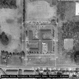
Wesley Acres Methodist Retirement Home provides government-subsidized housing for 117 low-income elderly residents. The building was designed in the late 1970s, completed in 1980 and stayed the same until the early 2000s.
Apparently, until the beginning of 2000, no one realized that from an aerial point of view it had a very clear shape.
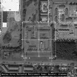
In the early 2000s – more than twenty years after it was built – someone realized that the aerial view of the building was an enormous swastika and two new wings were constructed. The alteration was funded by the US Department of Housing and Urban Development.
However, the discussion went on and in 2008 people were still arguing that the addition did little to hide the shape and maybe accentuated it. New options for another renovation were studied.
In 2019 the infamous-shaped building is still the same.

In 2006 the American-Israeli researcher Avrahaum Segol told the world that the Naval Amphibious Base of Coronado, located south of San Diego, seen from the sky was a giant swastika. The base was built in the late 1960s and … spoiler … despite all the clamor, it is still exactly the same in 2019.
The mediatic pressure and attention was so high that over the last few years, the Navy allocated $ 14 million for the modification of the base; but the actual usage of the money went not into de-nazifying the base but rather in other upgrades and repairs.
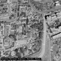
In the area of the Kenyatta National Hospital, in Nairobi, four low buildings have been recognized to have a planimetric disposition that recalls the swastika symbol, two of them are oriented in counterclockwise direction, and the other two in the clockwise direction, similar to the symbol adopted by Nazi Party in 1920.
The blocks have been designed and built when Kenya was still a British colony, after the war, and since then they are the nurse’s living quarters.

In 2015, close to Brindisi, in Italy, an entire swastika shaped neighborhood was discovered. Built in the 1990s, no one seemed to have realized the shape of the buildings until someone found them on Google Maps. The impact of the discover and the local media clamor led to a political discussion and an official question to the municipal administration, that, of course, was not responsible for a town planning authorization granted so many years before.
Anyway, the group of residential and touristic structures seem to be fine from the point of view of the building authorizations, and today nothing has been done to change them.
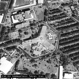
On November 2010 a Star of David was discovered on roof of the Iran Air Headquarters by a Google Earth user, over thirty years after the building was constructed. Iran Air Headquarters have been built by Israeli engineers before the 1979 Islamic Revolution, when the relationship between the two countries was better.
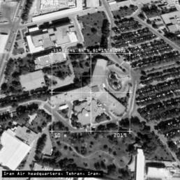
After the Star of David was discovered and reported in the media, government officials ordered to immediate remove of the Jewish symbol, that is no more visible today.
Involuntary pranks_ series
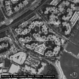
Apparently, someone discovered that a group of buildings in Singapore have a resemblance to the little alien bots of the classic 1978 Space Invaders arcade game.
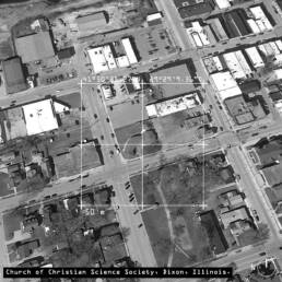
In Dixon, Illinois, there is a church that looks like a penis when seen from above. The project seemed to be developed in that form to preserve a tree that was on site.
The prize for the best answer goes to the Christian Science Dixon itself that seemed to have accepted the discover in good humor, announcing the arrival of a giant fig leaf, on Facebook.

Forms designed on purpose_ series
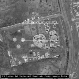
In India, in 2013, the Sri Sathya Sai Sanjeevani Hospital, which is a dedicated center that offers cardiac care to children, was built in a heart shape. This is clearly visible from Google Earth.
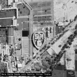
Dera Sacha Sauda is a religious cult established in 1948. Its main center is situated in the city of Sirsa in the northern India, and it is a hearth shaped building with three structures inside of it that look like letters.
It’s leader Gurmeet Ram Rahim Singh was sentenced to twenty years in jail for rape, and also prosecuted for ordering forced castrations of his devotees and murder.
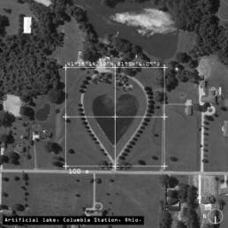
In Columbia Station, Ohio, a heart-shaped private lake was made.

Similar, to the hearth-shaped lake, searching in the area of Iacanga, close to Sao Paulo, it is easy to find an artificial man-shaped lake representing a person standing 140m tall.
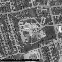
Health Centre in Ontario, built in 1951, seen from above looks like a man figure. Due to the gazebo placed between the building “legs” seems that an aerial image of the building was also published on Playboy. It has not been possible to find the name of the architect, but in the meantime, area residents seemed pretty entertained from the news.
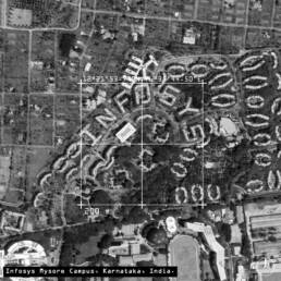
Not a big caption needed. The architects of the Infosys Mysor Campus decided that would have been a great idea to design those buildings to read “INFOSYS” from the sky.
Note to the text
The title of the contribution is quoted from the song Gaetano by Calcutta. The literal translation is: “I made a swastika in the center of Bologna… but was it just to fight”
The contribution avoids judging the direct intention or not of the architects to build swastika shaped buildings and focuses on the social impact that the democratization of satellite views had on giving to all the people a new point of view – that before belonged to planners and few other people.
… Anyway, I’m sure we all agree that Nazism sucks.
Reference List
- Kim, Dana. 2019. “The Democratization of Space and the Increasing Effects of Commercial Satellite Imagery on Foreign Policy.” New Perspectives in Foreign Policy 18: 35-38.
- Meyer, Robinson. “Google’s Satellite Map Gets a 700 -Trillion- Pixel Makeover,” The Atlantic (27 June 2016).
Photo credits
All images are from Google Earth, edited by the author.
Matilde Pitanti
PhD student in Architecture. Interested in urban issues. I’ve sent a great CV but the editorial team censored me. If I am not here, I have gone sailing.
On Instagram: @mati.pit